

UI/UX · Case study · Airwalk by Airwalk ·
Research · Brand · Prototype · Build · Launch ·
One case, start to finish
The case
Case file 00
A studio's own website is its hardest client. It has to prove 14+ years of craft in a few seconds, work just as well on a phone, speak two languages and still feel like nobody else's.
Client
Airwalk, our own studio
Goal
Win new clients and show 14+ years of craft at first glance
For whom
Businesses that need a brand, a website or content that sells
Scope
Brand identity, UI/UX, web design and development, motion, 3D
Platform
Webflow, with WebGL and JavaScript written from scratch
Languages
English and Romanian
Pages
Home, About us, Services, Portfolio, Contact and legal pages
The process
Every Airwalk project follows the same route. Here it is, step by step, on our own brand.
01
Every project starts with questions, not pixels. Who is it for? What should people feel? What should they do next? For Airwalk the answers were clear: win new clients, show 14+ years of craft in seconds and feel unlike any other studio.
Result: a clear brief
02
We studied the audience, the market and how people really look at a studio's website: quickly, often on a phone, between other things. Online inspiration was kept to a minimum. Every idea on these pages was thought through by us, from start to finish.
Result: goals, audience and a content map
03
Before any screen, the rules. An eleven-shade palette built around Frost, Ink and Pewter. Three typefaces with one job each. Topographic contour lines as the signature motif. All of it written down in the Airwalk brand book.
Result: brand book, Edition 01
04
The wing was refined by hand for symmetry, with every stroke at the same weight. Then came versions for light, dark and Pewter backgrounds, and a handwritten Airwalk signature, chosen from five options.
Result: logo, lockups and signature
05
Every page was planned as a sequence: a title panel, a zoom stage, a statement, then the content. The layouts are shared across the site, so it reads as one piece, while every page brings its own content.
Result: page structure and a layout system
06
Ideas were built as working versions, not pictures. The important ones were built twice, side by side, on private test links, and judged on a real phone and a 2K screen before one was kept.
Result: working versions to compare
07
Webflow carries the structure and the content. WebGL and JavaScript, written from scratch, carry everything that moves: the cursor reveal, the 3D wing, the living contour terrain and the rolling letters.
Result: a live website on airwalk.ro
08
Launch is where the polishing starts. Speed passes, a full Romanian version, fixes for every phone size and details tuned one by one, until it felt right on every screen.
Result: faster, bilingual, polished
Foundation · Brand book
Before any screen was designed, the rules were written down. The book grew with the website, and Edition 03 matches its final form: thirty-two pages on the idea behind the brand, the logo, colour, type, contour lines, layout, imagery and real applications. Every page of this website follows them. Browse the book below and open any page.
Seven chapters
01
The brand
p. 04
02
Logo
p. 06
03
Colour
p. 14
04
Typography
p. 16
05
Contour lines
p. 18
06
Layout & interface
p. 23
07
Imagery & applications
p. 28
Two editions
Format
32 pages, A4
Screen edition
RGB, for screens and sharing
Print edition
CMYK, 3 mm bleed and crop marks
Three rules on page two
Rule one
Frost, Ink and greys only. Photography inside a frame may carry colour; the frame never does.
Rule two
Leave more room than feels necessary. Minimal does not mean empty; it means every element earns its place.
Rule three
Contour lines make a layout recognisably Airwalk. Use them once per composition, with intent.
Foundation · Colour
No pure white and no pure black. Frost is softer than paper, Ink is gentler than black, and Pewter sits quietly between them. Tap any colour to copy it.
Frost
#F6F5F1
Backgrounds and light surfaces
Ink
#1C1C1A
Text and dark sections
Pewter
#A6A49E
Accents, hovers and quiet details
The full scale
Readable by design
Every text pairing was checked against the accessibility contrast guidelines.
Ink on Frost
15.65 : 1
AAA
Pewter on Frost
2.28 : 1
Accents only
Pewter on Ink
6.85 : 1
AA
Foundation · Type
Chosen after setting real headlines and real paragraphs side by side. Type your own words below and see all three at work.
Syne
Headlines
Wide, confident and a little unexpected. Picked after comparing it with three other display typefaces.
Shaping the future, one frame at a time.
Instrument Sans
Reading
Calm and clear at every size, from a phone to a 2K monitor. It carries every paragraph on the site.
Shaping the future, one frame at a time.
JetBrains Mono
Labels
Numbers, labels and small details, set like notes on a technical drawing.
Shaping the future, one frame at a time.
Foundation · Motif
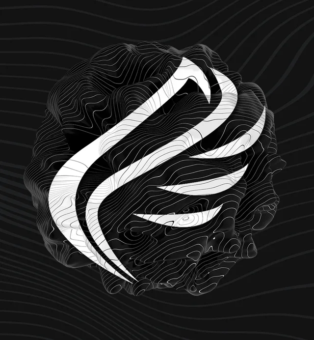
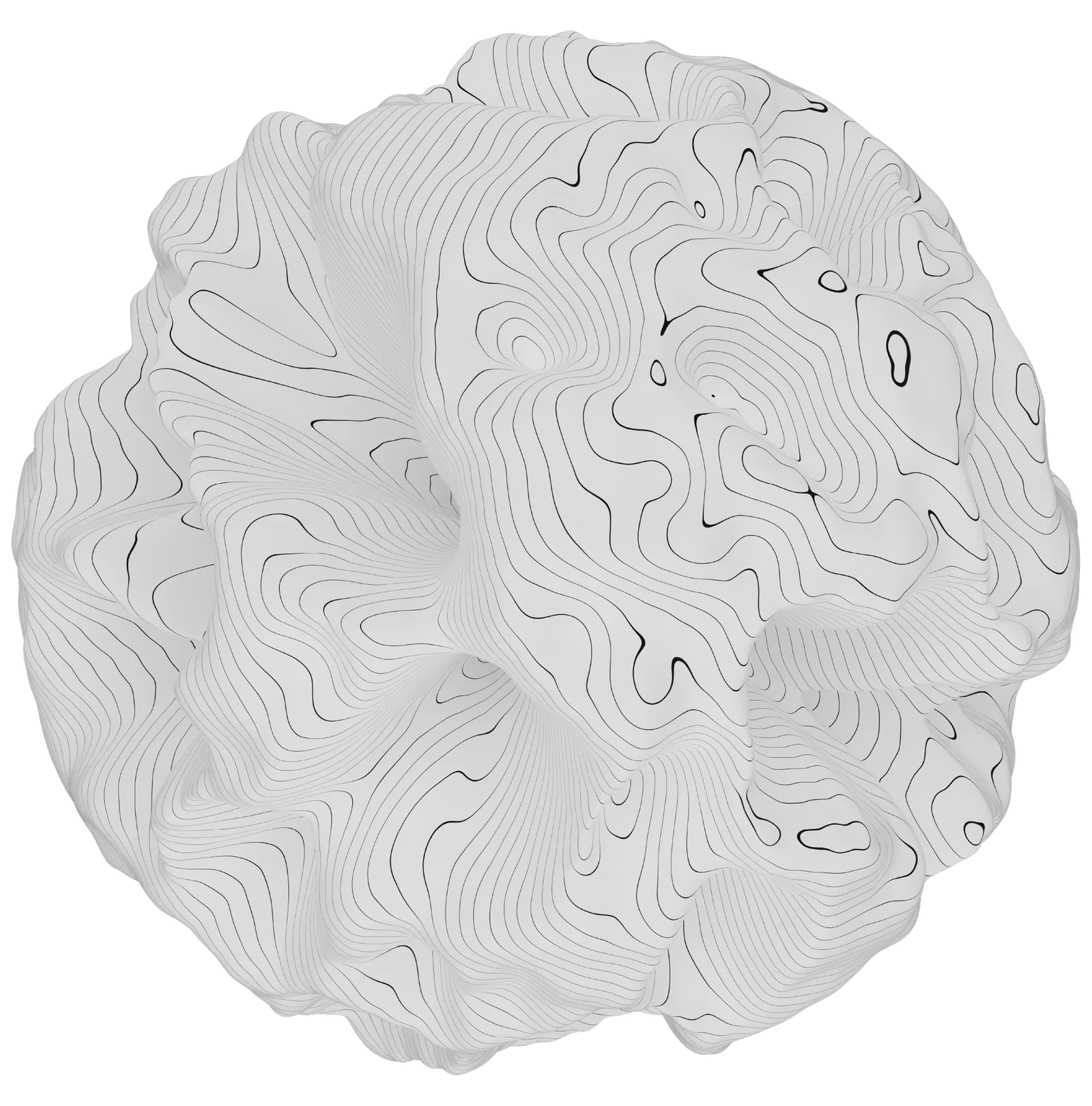
Our signature motif comes from topographic maps: lines that join points of equal height. Move across the map and raise the ground yourself.
01
A height map is turned into contour lines, so no two pieces are ever the same.
02
Just like on a real survey map, so the eye can read the height at a glance.
03
The highest point of the terrain is a flat plateau, the place the logo calls home.
04
Lines were chosen over soft, organic shapes. They feel measured, and measured is how we work.
The mark
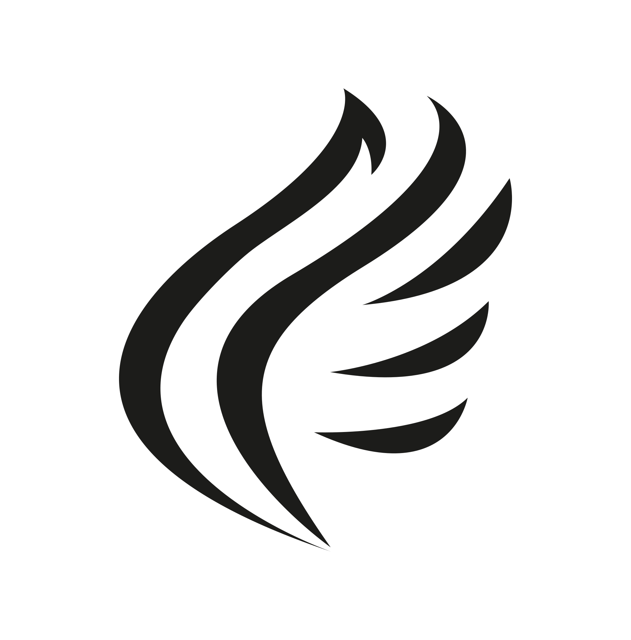
Five shapes, one gesture. The wing was redrawn until it balanced and every stroke carried the same weight. Then it learned to sit on any background.
The signature
Five handwritten options were drawn. Option B became the Airwalk signature: it writes itself in the opening scene, in the footer and behind the countdown.
The mark · In 3D
The wing is made of five strokes, and each one stands for one part of our work: the first for graphic design, the second for web design, then UI/UX, social media, and photo and video. Together they make one mark, the way our five crafts make one studio. Point at the wing and it comes apart, so every stroke can be read on its own. Drag to turn it, or use two fingers on a phone.
01
The first and largest stroke. Where every brand starts: the logo, the identity, everything printed.
02
The second stroke. Websites designed and built from scratch, like this one.
03
The third stroke. Interfaces planned around how people really use them.
04
The fourth stroke. Meta campaigns, posts and stories that keep a brand present.
05
The fifth stroke. Pictures and films that show the work at its best.
From a flat mark to a living wing
01
It started as the wing from the brand book: five strokes drawn by hand, balanced and all at the same weight.
02
Each stroke was traced from the logo file and extruded into its own solid, so the wing keeps its exact outline from every angle.
03
See-through walls, a glowing top edge and a soft glass face, drawn live in the browser with WebGL written from scratch. It is never a video.
04
A numbered pin on every stroke names the craft it stands for.
05
Small lights run along the edges, so the wing feels alive even when nobody touches it.
06
Point at it and the five strokes come apart in depth. The stroke under the cursor turns solid, so you always know which craft you are on.
07
At the end of the testimonials, the names of the programs we use float up around the wing and step aside from the cursor.
08
It leans gently as you scroll, as if it were catching the air.
09
Click a stroke or its pin and it opens that service on the Services page.
10
Two fingers turn it on every axis, and it settles back to level when you let go.
11
It renders at high sharpness and follows real time, so it stays smooth on any screen without draining the battery.
12
The Ink wing was rebuilt to match the Frost one exactly: the same glass, the same light, the same explosion. Only the colour changes.
Interface · Buttons
Every button on the site comes from one kit: one shape, one shadow and one hover, from the menu to the footer. There are no outlines, so each button reads as one solid object. Point at them, or tap them on a phone.
On Ink
On Frost
Shape
10 px corners, about 50 px tall
Type
Syne Bold, 15 px, capitals
Depth
A soft Ink shadow and no outline
Hover
Pewter fills in from the top, the text turns Ink and the arrow redraws itself
Rule
Never two buttons side by side doing the same job
Interface · Menu
The menu is the part of a website people use most, so it was refined more than anything else. Four hover styles were built and compared on the real menu. Try all four below; the letter wave is the one we kept.
A
Simple roll
B
Letter wave
C
Contour line
D
Cursor preview
Home
About us
Services
Portfolio
Contact
How it got there
01
A curved panel drops in, the page tiles appear and every link rises from behind a mask.
02
The columns drift with the cursor, the toggle lines turn into an X and a living contour terrain moves behind it all.
03
Picked from four hover styles. Each letter rolls into Pewter 28 milliseconds after the one before, while the other links dim.
04
The bar checks the colour under it four times a second and switches between Ink and Frost, so it stays readable on every section.
05
A Book a call button sits next to the menu on every page.
06
The toggle, the call button and every other button now share one style.
07
An EN | RO switch inside the menu changes the whole site at once.
08
Every page tile shows its name set in the brand typefaces.
09
Links mix the three typefaces, and an inverted ball card sits in the top corner.
Interface · Hero
The opening screen has to say Airwalk before a single word is read. It went through more than twenty-five versions. These are the turns that shaped it, including the ones we let go.
01
Contour terrain in Frost, with a darker terrain hidden underneath. Wherever the cursor moves, the hidden one shows through.
Kept
02
Generated shapes made way for our own contour ball and wing, moving as two separate layers.
Kept
03
A sphere and a wing built entirely in code. Technically impressive, but it did not feel like us.
Dropped
04
A fine wireframe shell around the ball stays invisible until a single band of light sweeps down over it.
Kept
05
The wireframe lines were halved, and slow contour lines started drifting inside the wing. This is where it clicked.
Kept
06
Colours split slightly at the edges of the reveal, the way light does through a lens.
Kept
07
On iPhones the wing appeared tiny in a corner. The artwork is now prepared before it reaches the graphics card, so every phone shows it right.
Kept
08
Scrolling shrinks the hero into a card, two rows of words slide past and the signature writes itself.
Kept
09
A classic headline layout and a giant AIRWALK wordmark ran side by side. The wordmark stayed.
Kept
10
The ball and the wing tilt towards the cursor, and the reveal reaches every edge of the screen.
Kept
11
A camera-style blur in the background was tried, then switched off. Speed mattered more.
Dropped
12
The same scene became the title panel of every page, with the page name in place of the wordmark.
Kept
Interface · Layouts
The homepage is a set of building blocks, not a template. Each page starts from its own content, then picks the layouts that fit, in any order and as many as it needs. That is how every page feels part of one site without repeating the others.
01
Every page gathers its own information before any design starts.
02
Only the homepage layouts that suit that content are used.
03
Any order, as many as needed. Two layouts can even merge into one section.
04
Backgrounds flow from one section into the next, with no hard lines between them.
Which layout lives where
Home
About us
Services
Portfolio
Contact
UI/UX
Legal
Hero and title panel
Zoom stage and signature
Statement
Sliding gallery
In numbers
Kind words
Founder and CEO
Tools and craft
Stacked chapters
Questions
Closing band
3D wing
Text column
Contact block
Menu and footer
Decisions
Good decisions need something to compare. These parts of the site were built in more than one version and tested for real. Each card shows the version we dropped and the one we kept.
01
Dropped
The first version, replaced after a side-by-side test.
Kept
Contour rings draw out from the wing while a counter runs from 000 to 100, then an Ink sheet slides away along a wavy contour edge.
02
Dropped
A sphere generated in code.
Kept
A 3D render of our own, with the wing at its centre.
03
Dropped
Version A, a complete layout of its own.
Kept
Version B: an index, stacked chapters and three ways to work together.
04
Dropped
The first scroll-in animation.
Kept
Cards open like a window from a rounded inset while the picture settles from a zoom, column by column.
05
Dropped
A live clock showing the time in Romania.
Kept
A five-minute countdown that runs down as you scroll, with the signature behind the digits.
06
Dropped
Options A, C, D and E.
Kept
Option B, now written across the whole site.
Beyond the website
A brand is real only when it holds up outside its own website. The first ten social posts were designed from the same book: the same colours, the same type and the same contour lines, in post and story sizes.
Posts
10, at 1080 × 1350
Stories
10, at 1080 × 1920
Campaigns
3: meet Airwalk, the work, the next project
Captions
English and Romanian for every post
Under the hood
A small fluid simulation runs on the graphics card and follows your cursor. Wherever it flows, a second picture shows through, and the colours split slightly at the edges, like light through a lens.
The first screen is a stage. As you scroll, it shrinks into a card, two rows of words slide past and the Airwalk signature writes itself. A first impression becomes a short opening scene.
Yes. Drag it with a mouse, or turn it with two fingers on a phone. Every feather leads to one of our services.
Links roll their letters when you point at them, and text arrives behind a Pewter block that wipes across. Small movements that keep the eye busy and make the site feel made by hand.
The scripts were trimmed by about a quarter, images are served as WebP, and every animation runs on real time instead of screen speed, so it behaves the same on any display. Visitors who prefer less motion get less motion.
Airwalk works with clients in Romania and abroad, so every page reads in English and in Romanian. More than 900 phrases, checked line by line.
The case in numbers
3
brand colours
11
shades in the scale
3
typefaces
2
languages
32
brand book pages
5
signature options
4
menu hover styles tested
25+
versions of the first screen
170+
published code releases
900+
Romanian phrases
25%
less JavaScript after the speed pass
0
templates used
More UI/UX
Every Airwalk project follows these eight steps. Tell us what you need. A short brief is enough to start.
Start a project